It is over three years ago since I wrote the First of Two posts on maps. In the meantime, they have been visited by tens of thousands of people which is pretty unbelievable.
So I thought it was high time to post another offering all related to maps. I still enjoys maps as much as before and you may have noticed try to put them in my posts at every opportunity.
So without any further ado, here is the first one. See if you can guess what it maps before reading the description.
The map above if I remember correctly from 2 years or so ago when I first saved it for this very post, is a map of all successionist movements across the world. These are people who want to form their own independent country distinct from the larger one which they are currently a part of. Some of these are quite famous and well organised like the Catalans in Spain and others like large parts of Siberia are less well-known.

The map above clearly illustrates those places with the most deadly roads. I often tell my tourists that as horrendously busy as the road are in the U.K. they are about the safest in the world, even more so considering the population density. I’m not sure if deaths on the roads of Libya include those from RPG launchers.
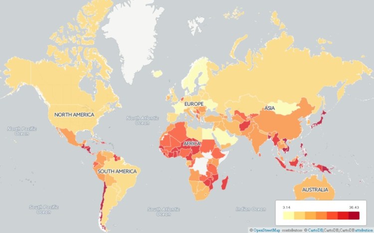
The map above displays which countries suffer the most from natural disasters. The Middle-East might be dangerous for lots of regions but a big chunk of it is relatively safe from natural disasters. Most of the African nations that are high risk are due to famines and diseases whereas Asia is much more prone to earthquakes though Bangladesh in particular suffers regularly from flooding.

This map above shows the minimum annual leave that workers in full-time paid employment are required in law. Workers in the United States and India could take up to 13 years to enjoy the same minimum number of holidays as those in the most generous nations. I remember hearing from a friend that Iran at one point had well over 40 national holidays, most of them religious in nature, and it was hard to get a normal working week due to the annual leave requirements on top of the religious holidays.

The map above shows the most marketable brand from each of the states of the United States. A great way to show the different uses maps can have rather than the regular geographic ones.
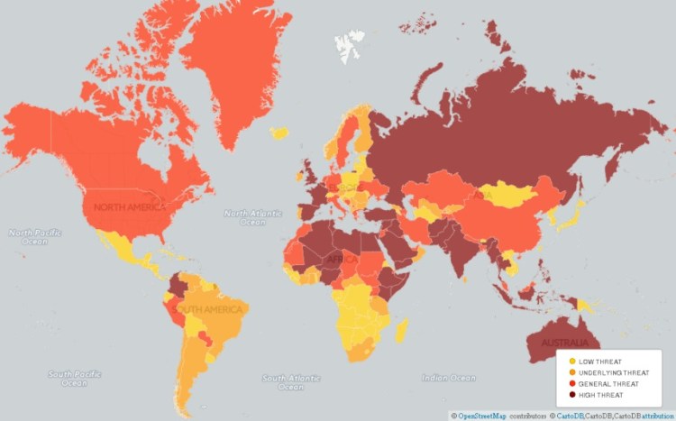
The map above shows up the risks of international terrorism per country. I don’t know about you but I always wanted to visit Mongolia and it seems to be about the only place with no terrorism and no natural disasters. Sure the roads aren’t great but who needs roads with all that open space?
 Above is an Isochronic map from 1881. This illustrates the journey time in days from the Royal Geographic HQ in London. Interestingly it was easier to go from London to San Francisco than it was to reach central Turkey. You can also see the bulges goring through Russia which is the effect of the Trans-Siberian Railway peeding up travel and communication.
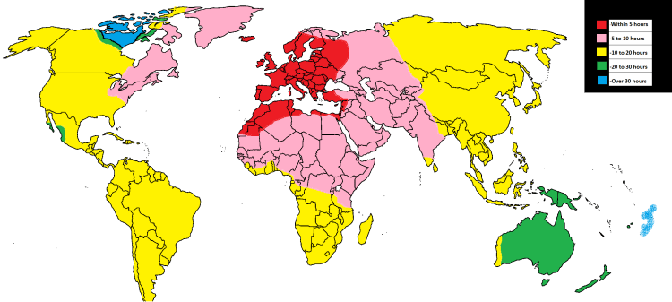 And finally the map above is a 2015 Isochronic map with travel times from London now measured in hours rather than days. Personally, I think the 1881 methods of travel are more for me.

The isochronic maps look particularly interesting. I might try working out some approximate maps for road travel in my area.
LikeLiked by 1 person
Thank-you. That would be a really interesting idea for road travel. Living on the edge of London, in one direction it can take me longer to go 5-10 miles (8-16km) than it does to go 75-100 miles in the other direction.
LikeLike
These maps are really interesting! 🙂
LikeLiked by 1 person
Thanks Melissa, glad you liked them 🙂
LikeLike
This is great. Really fascinated by the isochromic travel times. Thought there would be more green!
LikeLiked by 1 person
Yes, it is remarkable how little green there is!
LikeLike
Why is the color scheme so often gradations of yellow orange and red? Are these best for online display? Or colorblindness? Just curious. Great collection of maps. I share your cartophilia!
LikeLike