Amazing maps tracking the cargo ships of the world
I’ve posted plenty of posts dedicated to maps over the years but none quite like this. This special project was undertaken by UCL and Kiln in London and tracks all the major cargo vessels of the world. As well as being fascinating to look at, the project also had the aim of raising awareness of the pollution caused by global trade.
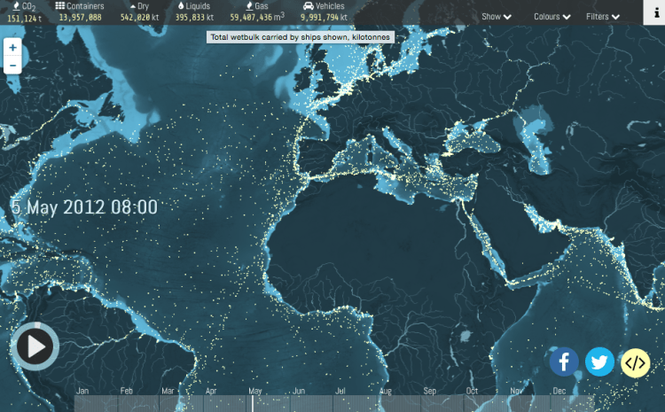
A single large container ship can emit the same pollution as that of 50 million cars. During the year of study in 2012, Emissions from international shipping for that year were estimated to be 796 million tonnes CO2 which is more than the whole of the UK, Canada or Brazil emit in a year. That’s an incredible 2.18 million tonnes CO2 per day or 90,868 tonnes CO2 per hour.
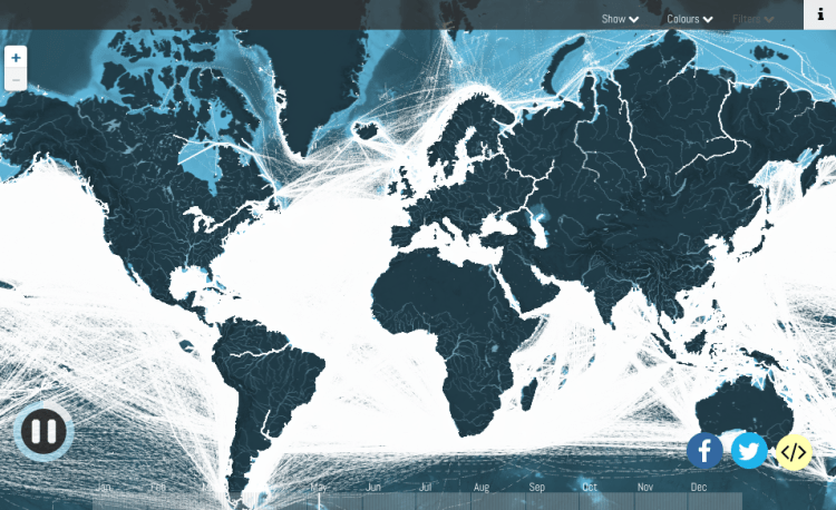
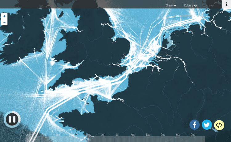
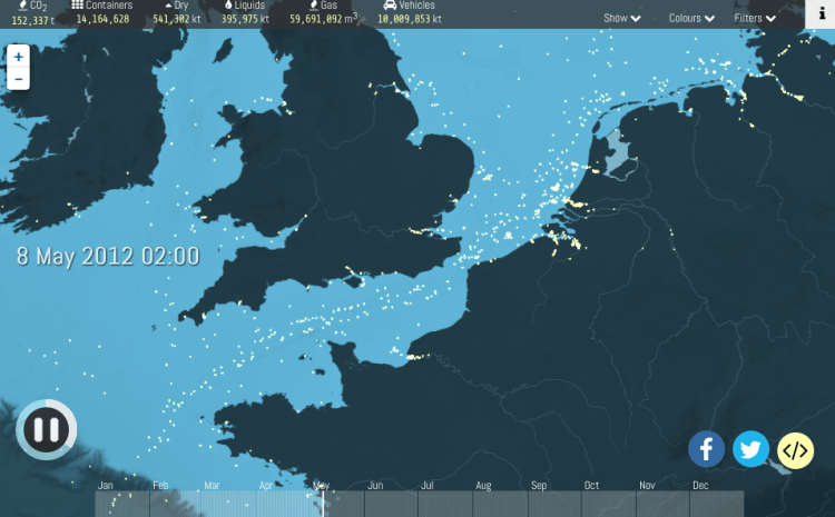
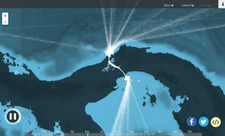
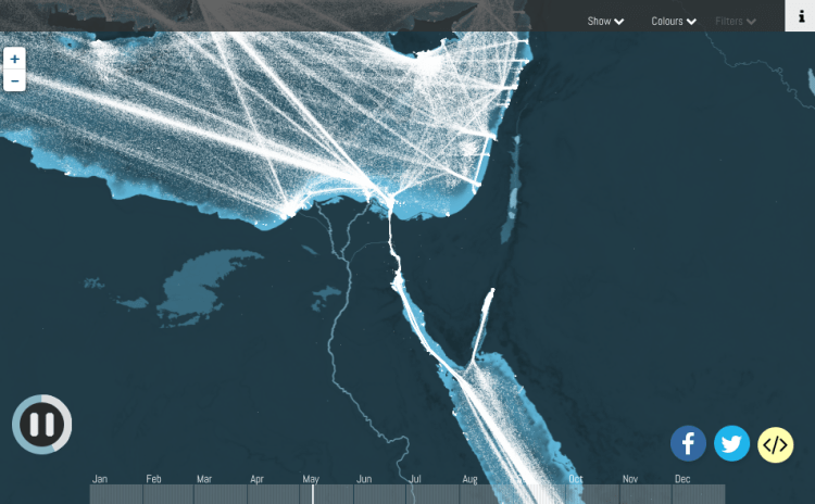
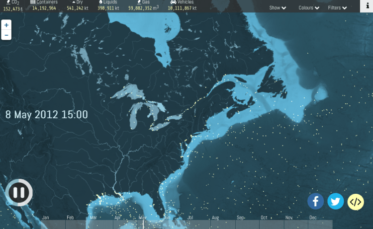
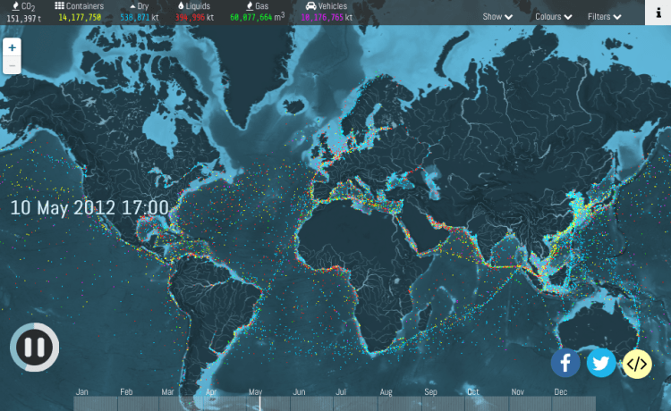
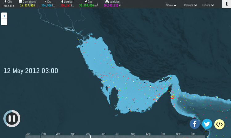
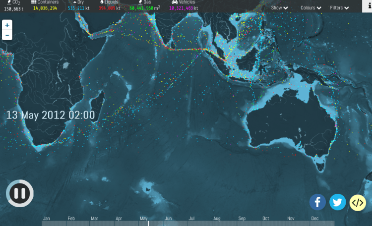
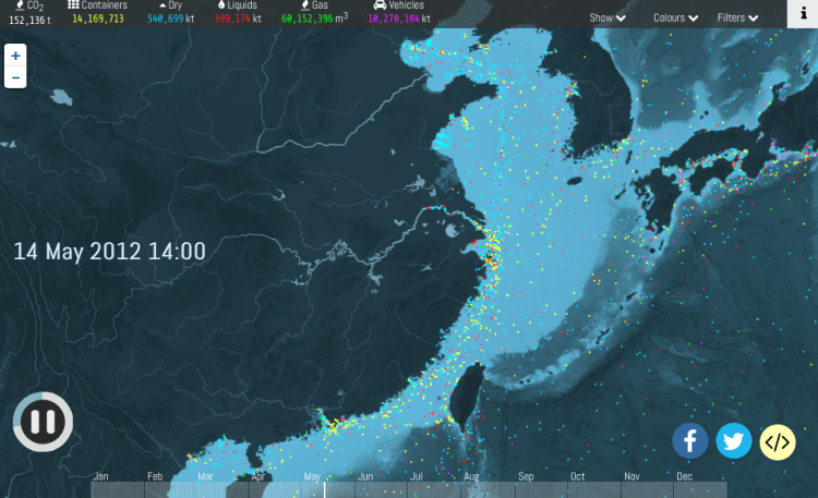
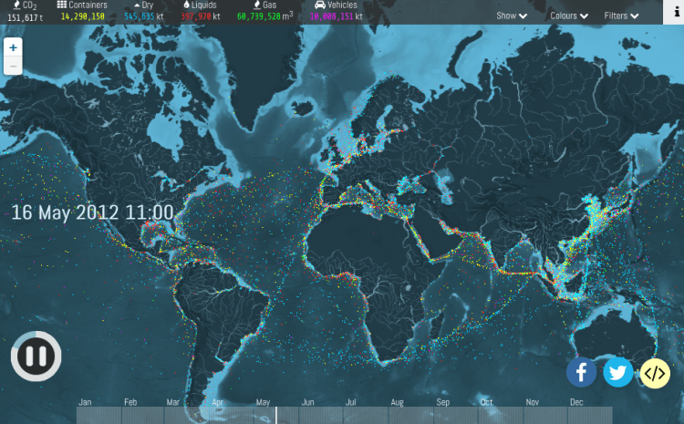
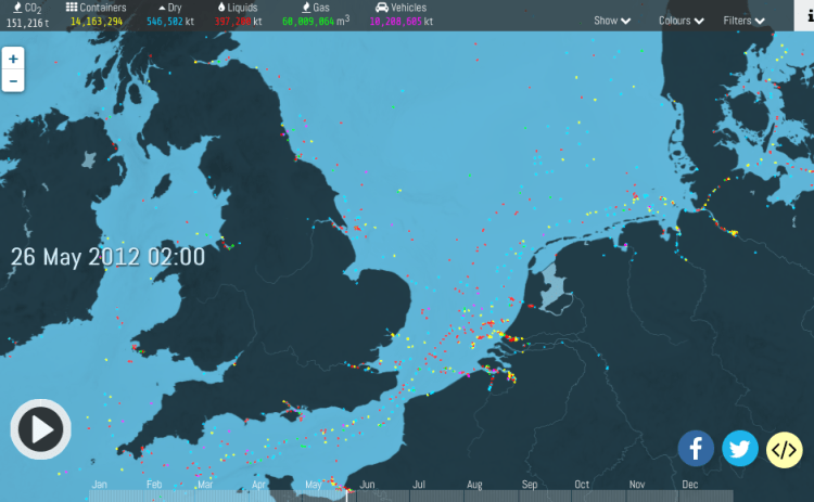
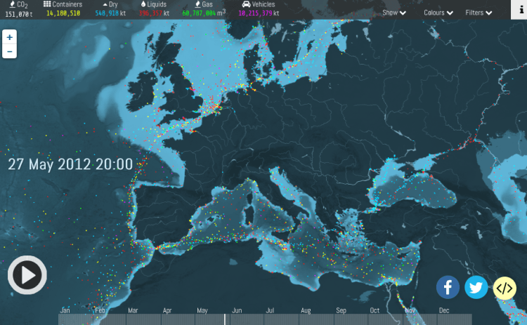
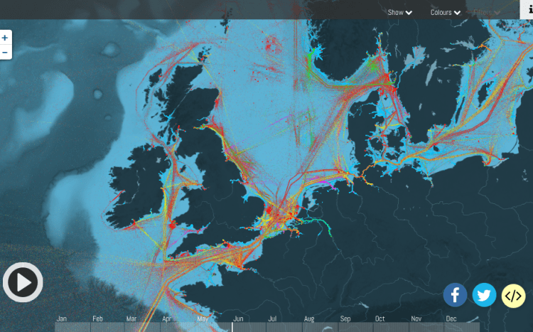
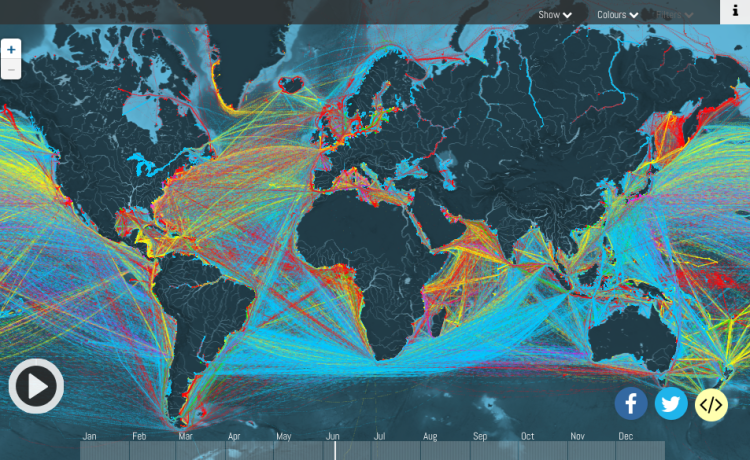
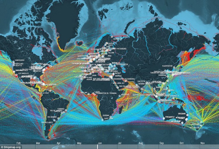
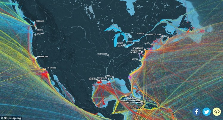
Tracking the cargo ships of the world.This map shows just how much of the worlds oceans are covered in trade routes. Notice also the major rivers in Russia & South America that are full of cargo ships. The Suez and Panama Canals and the route between the North American Great Lakes and the Atlantic. Britain is almost obliterated by cargo ports and estuaries.Marine traffic of Britain and Northern Europe all has to pass through the Straits of Dover. Like a busy road, vessels heading North East go in one lane and traffic heading South West go in the other lane… not to mention all the UK-Europe traffic that directs the main route.A daily image of major cargo vessels in the English ChannelThis map illustrates the routes of cargo ships as they enter and emerge from The Panama CanalThe shipping routes of the Suez Canal and S.E Mediterranean.Typical cargo traffic around the United States and CanadaThis map shows the vessels colour coded. Red are oil tankers, yellow are container ships and green are dry goods/Plenty of oil tankers emanate from The Persian GulfIncredible view of the shipping routes from the Arabian Sea, past India and down towards the overcrowded and often dangerous route by MalaysiaChina, the epicentre for container ship.Colour ships of Planet EarthColour coded cargo vessels around the S.E. United KingdomColour coded cargo ships of a random day around EuropeFascinating routes of cargo ships around the U.K. Notice how to save time, fuel and better weather and sea conditions, a vast majority sail past Dover. Still quite a lot of oil tankers go from the oilfields around Scotland and plenty of traffic into western ports such as Liverpool and eastern ports such as Hull, Middlesborough and Newcastle.Colour coded cargo ship traffic around the world
Major Ports of the worldCargo traffic from the East coast of North America
Below you can see a 1-minute extract of a video the end video.
Alternatively, you can click on the link below to watch the full interactive video with commentary which, unfortunately, WordPress doesn’t allow me to present on a blog.
I am a writer and traveller with a penchant for history and getting off the beaten track. With several books to my name including several #1 sellers. I also write environmental, travel and history articles for magazines as well as freelance work. I run my private tours company with one tour stated by the leading travel website as being with the #1 authentic London Experience.
Recently I've appeared on BBC Radio and Bloomberg TV and am waiting on the filming of a ghost story on British TV.
I run my own private UK tours company (Ye Olde England Tours) with small, private and totally customisable guided tours run by myself!

3 comments