Do you ever go on an unexpected diversion? I’ve just been on one and I haven’t left my desk. Diversions happen all the time. Sometimes they can be good such as when you’re browsing Wikipedia intent on looking up a specific fact only to end up several mouse clicks away. I’m diverted all the time at work, starting off doing what I intended only for the phone to ring, emails to arrive, the fax machine to jam and before I know it I am 6 0r 7 tasks away from the job that was urgent 2 hours ago. I might remember that original task but the chances of remember task 2 or 3 after completing diversion 7 is less good.
I do get diverted a lot in the garden, in the shops even on the television remote control. Maybe it is because life is so fluid. I could have a short attention span but I don’t think that is the case. Most likely it is because I have lots of imagination and an explorative tendency.
All of us writers no doubt get diverted when writing. To an extent it is healthy and shows us the story has a life of its own. You start off writing about Jack on the way home from work sat reading the newspaper on the train and before you know it not only has the passenger opposite left with his wallet and USB stick on the seat but Jack insists on seeing whose dead legs are poking out from the toilet compartment into the corridor.
That’s where my blog has taken me today. A few days ago I fully intended to write about something in particular. I even started writing the text but when I went online to find an appropriate graphic, that was it I was on an unexpected journey. A dead King of England here, a radio news broadcast there and a few topics filed for later blogging down the line and here I am going to talk about maps.
I’ve always been intrigued by maps. Maps can give out so much information, they can be beautiful to look at and they can be fun. No really.
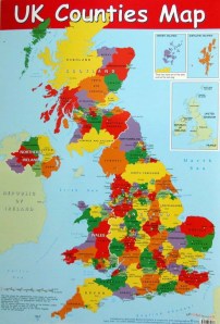
30 years or so ago I used to do jigsaws puzzle and my favourate jigsaw was ‘The Counties of Britain’. Each county would have a painting on it of what goes on in that county. Coal mining in Yorkshire, sailing off the South Coast and a good 50 square miles or so represented with a painting of people pushing a round cheese down a hillside. Bizarre. Soon afterwards I got a similar puzzle but this time a map of the world. Egypt was sandy with a Pyramid on it, there was a long wall in China and that country with cowboys on the one side and a statue of liberty on the other was a lot like my country but wasn’t quite. To complete the puzzle I’d always start off with the skinny places that stick into the sea. Japan, Italy and Central America and once I realised Japan didn’t connect into Austria then I had the world figured out.
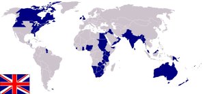
Everyone has seen maps of the world whether they are simple geographic maps or maps showing which areas have lots of rubber trees and corn fields. Even the basic map tells us a lot. People generally produce maps for themselves and as such put their own country at the centre of the world. Below is a basic version of a map that our fore-fathers in the UK would have been familiar with, the Empire map with you-know who right in the middle of things. Even geographic terms persist from this map. The Far East, The Middle East, The Near East are all based on distances from London. If you live in Nigeria then the “Middle East” to you should really be in South Africa and from Los Angeles the Far East should be Eastern Europe which to London is just the Near East. Oh this is confusing…
If you are from North America you probably have seen maps like this:

and playing on a hunch I imagined China would see itself as the centre of the world and would have London at the far west and New York at the far east. 10 seconds on Google and my guess wasn’t far wrong:

Of course this is all natural, everyone is pre-occupied by themselves and as the world is globular then there really is no right or wrong. Below is the most recent map I could find which if you look closely includes South Sudan in North-East Africa:
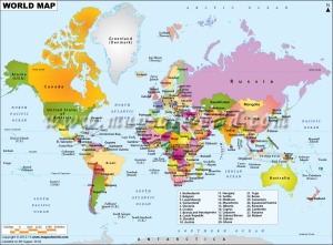
If you look at maps not only do they give you information but they also raise questions if you look at them. Many of these are about borders, just by looking at them the Canadian/USA border could not be resulting from natural boundaries such as rivers or Mountains. Why does Egypt have almost a rectangular border except for a few squiggles? Do near Moscow have anything in common with those Russians near Alaska? Why is the England/Scotland border the way it is? Is there a reason why there are all those seas as lakes from the Mediterranean eastwards, were they ever linked? How do they replenish themselves? All things I used to think about until I found out the answers.
These are all the sorts of maps that I would look at as a child but then when I got older I started looking at transport maps.

While looking at train maps in Europe I came across the one below for proposed high speed train routes in the USA. I love train travel, no flying involved and no driving for me. What’s not to like?

The map above is basic but it has told me of two places I have never heard of before, Eugene and St. Paul. The map doesn’t just show where the new rail routes may go but some of the biggest cities and natural trade and tourist routes.
These days the internet gives access to a whole host of maps, some of which weren’t even conceived of when I used to look at my paper atlases. There are too many to show here but here are two or three interesting maps I thought people may like to see.

This one above shows the connectivity of the world for for international travel and communications.
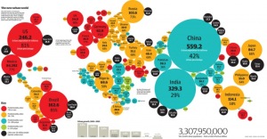
The map above shows the urban population for each country and the percentage of the whole population. Here in the UK we have 90% of the country living in urban areas, pretty much the highest anyway.
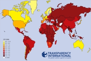


Finally we get to the map that started off this whole escapade. This is the modern version of the map I used to look at as a boy and I went through all the maps above and more just to find it. That’s the beauty of maps though and when you do get diverted maps can come in handy there too.
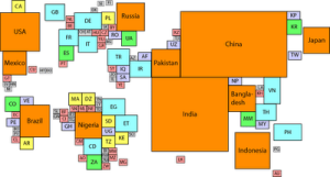
Looking at the map above and comparing it to the geographic maps further up shows lots of interesting points. One can’t escape the fact that though China and India are large countries, they have huge populations. Most countries have populations in balance with their territorial size although this doesn’t mean that they have the resources or are developed enough yet to reach western standards of living. Russia, Australia and Canada are just some huge countries with a relatively low population. There is no escaping the fact that for the size of the UK territorially, we sure are stuffed full of people.
I hope you liked my diversionary journey through the maps and I promise I’ll get back to original blogging point sooner or later.
Very interesting post… here is a great website and store in London… The Map House. They have an incredible collection of old original maps. http://www.themaphouse.com/
LikeLike
What a great link, thank-you. I keep thinking if we ever get an older style home it would be great to have a room or wall decorated by these old style framed maps. No I know just where to find them
LikeLike
I think maps are going to be disappearing treasures as GPS technology prevails. I love going back over the maps of the places I’ve been. Great post.
LikeLike
Thanks. I do too. You know you look at maps too much when you are flying somewhere new and you look out of the window and guess your location with about 90% accuracy as you have half the planets shorelines and cities and mountains burned into your brain!
LikeLike
It’s probably awful of me, but I never thought of American maps placing the US in the center. I just thought that was how they all were.
LikeLike
Hey don’t worry. I don’t think anyone really thought about it before. I guess it is something you only really notice if you see a foreign map.
I remember seeing an American map in a move the first time and thought hbow strange it was that the UK was over on the side 🙂
LikeLike
A recent issue of the Washington Post Magazine has an article by Kris Coronado about a map enthusiast, Dennis Gutz, in Washington, DC, and the group of map enthusiasts he started. The map portrayed in the article was drawn and published during the Civil War, but was quickly taken out of circulation, because it showed the locations of the forts that would be used for defending against the Confederates.
The article was published on page 6 of the April 7, 2013 print edition of the Washington Post Magazine, and is available online at http://www.washingtonpost.com/lifestyle/magazine/showing-off-his-wheres/2013/04/03/dac0b936-9bcc-11e2-9bda-edd1a7fb557d_gallery.html#photo=1
Unfortunately, to see the images and text on the web site you have to sit through an ad, and then click on arrows to see more pictures, with text.
LikeLike
Thank-you for your comment. That is a really good find you have there. I really like old maps, it takes you back to the period instantly and also you can often guess what the map was used for as military maps like these are totally different some other maps.
I am sure some other readers will enjoy that too.
LikeLike
I Have “World Map” right above the spot where I lay my head down to sleep 🙂
I Love Old Maps because it’s Sexy and Amazing!!! They are Beautiful Arts!!!
LikeLike
That sounds like a great idea. Similar to the Egyptians who would paint stars and moons on the ceilings in their burial rooms 🙂
LikeLike
Really??? Never Know that Before!.well, kinda give me idea for kids bedrooms (when I have kids later) 🙂
LikeLike
Awesome
LikeLike
You’re on my wave-length!
LikeLike
I enjoy reading your post. Thanks for the visit.
LikeLike
I loved this post. Thank you so much for writing it and sharing it with us.
LikeLike
I often work as an architectural surveyor and one of the things that is going by the wayside is the use of the old USGS maps-between that and a compass, that was what you depended on when looking for old buildings in rural areas. With phone apps and GPS now those maps are not used as much. I love maps too and I enjoyed reading your post.
Thank you too for visiting Move the Chair-I appreciate you taking the time to look!
LikeLike
Hello Stephen…interesting stuff. Mathew Flinder’s maps of Australia including Tassie showed incredible detail…. and he did it in a little boat …gutsy. I am pleased from studying your informative blog that in Oz we are not corrupt, we are happy, hardly any migrants here( comparatively) and there is a lot of country – but not many people…..oh yes, it really is the centre of the world. Be well . Tony
LikeLike
I’d just like to quickly point out that the reason so many maps have London at the center is because of the Prime Meridian. I’m from the USA and every would map I’ve ever seen has been centered around 0 degrees longitude. It’s actually really weird looking at America-centered because it’s just so illogical…you’ve split Asia down the middle. That’s not very good for perspective. Until looking at maps from China and Australia and such, I have literally never seen a fully connected Pacific ocean…it’s a whole new shape. So I guess the logical route is to center it around the Prime Meridian, for neutrality’s sake, but I think it’s also healthy to keep maps from different perspectives so that you can really get an idea of exactly how the Earth looks. A globe, I might also add, will absolutely never fail you.
LikeLike
I’ve been reading that the ancients centred their world around Giza, which apparently is the centre of the land-mass of the planet.
Another interesting angle is to take a view using the South Pole as centre, very quickly you see that in reality there’s only one ocean.
Thanks for all those lovely maps, I’m going to be busy. (Dammit …)
LikeLike
Yes, I have heard that about Giza too. I suppose it is pretty much where Asia and Africa meet. I am lucky enough to have been there a few times and it is a very interesting place.
You know I keep meaning to do a new maps blog but I just keep finding more of them and I never get round to writing it up 🙂
LikeLike
Reblogged this on mapsworldwide blog.
LikeLike
Hi, I’m from north america and my country is never in the middle of a map. But I’m from Mexico, because as you know, US and Canada aren’t the only countries in North America.
LikeLike
Hi Jimena, thanks for commenting. I think really every country should have a map where it is the centre of the world as really no-one is that interested in their neighbours whether it is the US, UK, Russia or China. I feel particularly sorry for those in South America, Southern Africa and New Zealand as they are always at the bottom when they have the right to be at the top too.
LikeLike
I actually don’t agree. For me having a map to learn geography that is center in Europe/Africa, is more objective and less egocentric. For my point of view, having your country in the center of a map its like saying that the world is the center of the universe. And also, my commentary was a criticisms to the people that think that only US and Canada are North America.
LikeLike
Any map (other than a globe) must contain hidden biases; even the choice of which cardinal direction to place on the top and the orientation of placenames reflect preconceptions and value judgments. I can’t imagine a way to avoid it. Perhaps they SHOULD be more openly egocentric (as they once were). For instance, China’s name, in Chinese, translates to “Middle Country” — no hiding behind false modesty or political correctness there!
LikeLike